Death by Beige
Why playing it safe is costing you relevance, and what to do before your brand flatlines.
Beige logos. Generic taglines. Safe sans serifs. Websites that feel like they were built by a committee. The founder calls it “elegant.” The designer winces. The audience doesn’t look twice.
Welcome to the branding beige zone, a graveyard of bright-eyed aspirations, where bold ideas dissolve into soft hues and even softer statements. Where every word is focus-grouped into ambiguity. Where nothing risks and nothing lands. We’ve borne witness to it countless times: a promising idea walks into a boardroom and walks out a shell of its former self. The logo, lowercase. The colours, muted. The voice, massaged into palatability. Yawn! If branding is meant to signal conviction, too much of what we’re seeing feels like it’s waiting for approval. It’s founder-friendly, investor-safe and remarkably forgettable. So we’ve created a cheat sheet so you can avoid that dreaded zone…
Without tension, there’s no edge, no spark, no staying power.
The problem isn’t minimalism, it’s the fear behind it; the idea that neutrality is safer than specificity. That premium must mean polished. That refined should also mean indistinct. But "friendly and modern" is not a strategy, it’s a default.
Why Safe = Forgettable
Memorability requires a point of view. The brands we love are articulating something specific:
Vanilla branding doesn’t offend, but it doesn’t land either. It hovers in a safe zone of visual and verbal indecision, where nothing sticks and everything scrolls right on by
The beige zone is startups indistinguishable from each other, all pastel palettes and recycled fonts. It’s wellness brands that feel like they were designed by the same soft-spoken algorithm. It’s founder bios that open with: “We couldn’t find it, so we made it.” It’s DTC identities that feel half-baked and half-hearted. Visual sameness is emotional flatlining, and it’s making brands disappear.
What Bold Actually Looks Like
Bold isn’t always brash. It’s sometimes incredibly quiet, but it’s never vague. To be bold is to know what you stand for, and to design around that knowing. The clearest brands resonate without necessarily raising their voice.
Oatly: Brave branding at its sharpest. Oatly didn’t invent oat milk, but it reintroduced it with such clarity and conviction one would be forgiven for assuming they did. The line “It’s like milk but made for humans” reframed a fringe alt-dairy into a daily ritual, challenging decades of dairy logic with one brilliant provocation.
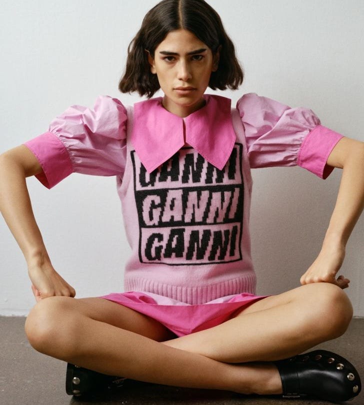
Ganni: The poster child for playful confidence. Less fashion label, more cultural playground. A Copenhagen-born moodboard where dopamine dressing collides with Danish cool, and every collection feels like an inside joke you’re invited in on. While others are still decoding what Gen Z wants, Ganni’s already invited them over, handed them the aux cord, and made them feel like co-creators. It’s building a brand world with bold conviction; the kind with cardigans and cult followings in equal measure.
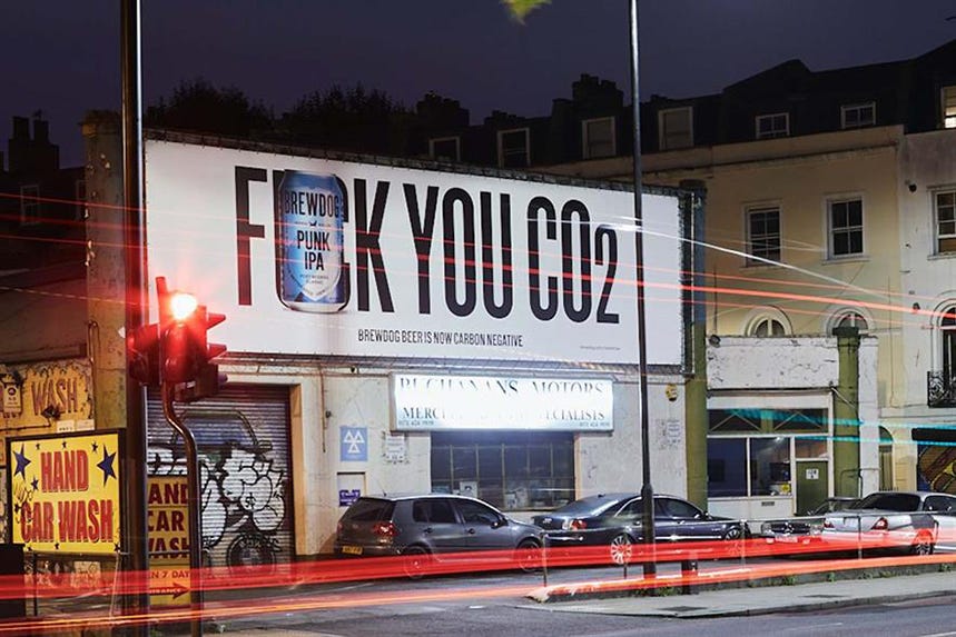
BrewDog: From the start, BrewDog refused to colour inside the lines. Launched with a DIY ethos and no patience for polish, they sold attitude as much as they did craft beer. Their tone? Unapologetic. Their campaigns? Confrontational. Their presence? Impossible to ignore. It wasn’t a rebellion for rebellion’s sake, it was strategic dissent and it gave the brand a pulse most competitors still can’t match.
Figlio Bastardo: Call us biased, but few brands own their name like this. Translating to “Bastard Son”, the name says it all. A rebellious riff on Italian culinary tradition, it’s a brand that pays homage to heritage while happily breaking its rules. Everything, from the menu to the moodboard, delivers personality in spades.
Rule 4: How to Avoid the Beige Zone
Designing a memorable brand requires clarity. Not just about what you do, but about who you are. Don’t design for your investor deck. Design for the kind of customer who would wear your hoodie, quote your copy or line up in the cold for your next drop. Define a voice that goes beyond relatable to become distinctly recognisable. Stop referencing your competitors and start referencing culture instead. Crucially, let your brand behave like a person: with opinions, tastes, contradictions. One of our favourite refrains? "You don’t have to be loud. But you do have to be something."
Because clarity, not volume, is what cuts through the swathes of same-same brands.
Practical questions to guide your brand:
— What’s the spiciest thing we could say about what we do?
— What do we refuse to do, even if it’s popular?
— How would this feel if it were art, music, food, or film?
— Who are we not for, and are we OK with that?
Final Word: Safe Doesn’t Sell
Playing it safe, paradoxically, isn’t safer. It’s riskier. Because in a saturated world, safe branding is a speed-run to irrelevance and being overlooked is a faster death than being disliked. The brands we remember — the ones we screenshot, recommend, build Pinterest boards around — aren’t trying to please everyone. They’re magnetic because they know exactly who they are. They’re intentional, sometimes confrontational, always clear. And they know that when your brand starts to look like everyone else’s, it stops mattering altogether.
Subscribe to Public Opinion for more brand truth bombs, spicy takes, and the sharp, no-fluff insights founders actually use to win.
Public Opinion is where we talk. Smack Bang is where we do. Come see what we’ve been building →smackbang.co






I’ve literally been mid-draft on a post saying the same thing, but from a spatial design lens. Because it’s not just branding that’s blending into beige, it’s actual spaces too. Most boutique gyms, wellness studios, jewellery pop-ups? You walk in and it’s beige on beige on beige. Soft lighting, arched doorways, eucalyptus in the corner, maybe a neon sign if they’re feeling rebellious.
But that look isn’t bold anymore. It’s become the blueprint. And what’s wild is, when I work with founders who want to do something different—darker, louder, more emotionally textured—they get nervous. Like, who gave them permission to step outside what’s aesthetically acceptable?
That’s why I love this piece. It’s not just about what things look like, it’s about what they stand for. Because if your brand or space isn’t saying anything real, what’s the point? The creatives I work with, the ones I really rate, they know who their customer is. Not just her age or her budget, but what she feels. What gets on her nerves. What makes her say, yes, this place gets me. That’s what I design for. Not trends, not feeds, but that quiet little gasp of recognition when someone walks in and knows they’re in the right place.
Right on the money.